I recently updated my Apple devices to the new (and ugliest of all) OS version, 26.2, and I noticed a weird issue on a website I am working on: the hero section was suddenly not centered. I found a solution, but I probably discovered a Safari CSS calculation bug along the way.
Here's a screenshot of the issue as replicated in a Codepen — notice how the text is cut off and off-center.
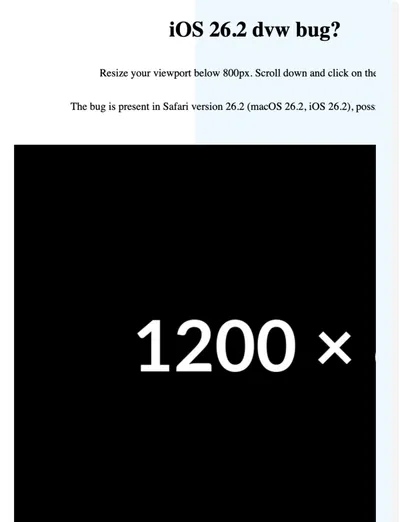
The issue is caused by the hero graphic, which is 120dvw in size on smaller viewports and then moved off-screen. We hide the rest of the image by setting overflow: hidden to the .hero section. This is to achieve a cut-off effect, which was a design decision made by someone else.
Here's how I defined this element in CSS:
.hero {
  --gfx-size: 120dvw;
  --gfx-offset: calc((100% - var(--gfx-size)) - (100% - var(--wrapper)));
  --wrapper: min(90dvw, 1000px);
}

@media screen and (width < 800px) {
  .hero__gfx {
    min-inline-size: var(--gfx-size);
    margin-inline-end: var(--gfx-offset);
  }
}
Here's the CSS calculation for the --gfx-offset variable:
--gfx-offset: calc((100% - var(--gfx-size)) - (100% - var(--wrapper)));Let's break it down:
(100% - var(--gfx-size)) - (100% - var(--wrapper))(100% - 120dvw) - (100% - min(90dvw, 1000px))(100% - 120dvw) - (100% - 90dvw)100% - 120dvw - 100% + 90dvw-120dvw + 90dvw-30dvw
The margin-inline-end property should be set to -30dvw. It works in Chrome, and I love how you can see these steps by hovering over the calc keyword in Chrome DevTools. For a viewport size of 600px, the value is -180px.
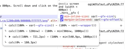
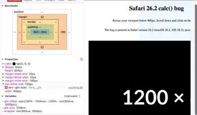
In Safari, you cannot see these calculations (at least as far as I know), but you can see the calculated box model. The margin-inline-end property is set to -180px, which is correct for a viewport resized to 600 pixels.
However, I noticed that the inline-size property is set to 900px, which is the min-inline-size value of 120dvw (720px) increased by the margin-inline-size of -30dvw (-120px). But that can't be right, can it?
I tried all sorts of things and I found two solutions:
-
Set the
margin-inline-endproperty to-30dvwmanually, without a calculation. -
Replace the
100%value with a100dvwvalue in the calculation.
I don't have enough knowledge about browser engines to know why this works, but it does for us. At least for now.
Here's the Codepen demo: